
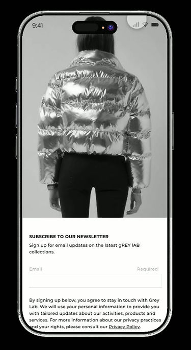
Brand Digital Commerce Platform
Designing a unified online platform that merges brand storytelling with an intuitive shopping flow.
My Role
Lead UI/UX Designer · Brand Identity & Website Design
-
Designed user flows and mockups for both desktop and mobile platforms.
-
Collaborated with fashion designers and developers to align visuals with technical feasibility.
-
Redesigned the brand identity and typography system to build a cohesive online presence.
-
Created interactive prototypes and refined UI through iterative design reviews.
Tools
-
Figma
-
Adobe Photoshop
-
Adobe Illustrator
-
Adobe XD
-
After Effects
Team
-
Fashion Design Team
-
Developer
-
Visual Designer
Duration
-
2021 – Present
Company
-
GREY LAB

The Problem
Customers found it difficult to understand and connect with the brand’s identity because it lacked a dedicated digital platform. leaving the experience dependent on third-party marketplaces.
Product presentation and brand storytelling remained fragmented, causing weak emotional impact and low brand recall without a unified online flagship.
The Solution
Created a unified digital presence that clearly expresses the brand’s personality and strengthens audience connection. Streamlines the shopping experience across desktop and mobile, and enhances customer engagement and conversion through intuitive navigation and improved site structure.
1. Discovering the Latest Collection
Users open the website to browse the brand’s newest collections and product launches. They can scroll through curated visuals, swipe to discover additional styles, and quickly find trending items that match their interests.

2. Browsing the Collection
Users explore the full collection through flexible viewing options that suit their preferences. They can easily sort products to find exactly what they’re looking for, ensuring a personalized and intuitive browsing experience.

3. Exploring Product Details
Users open a product to view high-resolution images and explore key details, including materials, sizing, and style information. They can check the size chart and conveniently add items to their bag, with a side panel that lets them continue browsing and managing selections without leaving the page.

4. Navigating the Menu and Wishlist
Users open the menu to browse product categories or access their wishlist quickly. Within the wishlist, they can review saved items, explore details, and manage selections, making it easy to keep track of favorites and continue shopping seamlessly.

5. Managing Personal Experience
Users log in to take control of their shopping journey, managing shipping details, tracking orders with full product and delivery information, and connecting directly with customer support. This page also fosters an ongoing relationship with the brand, allowing users to revisit favorites, receive personalized updates, and stay engaged with new collections.

6. Accessing Support and Information
Users visit this section to quickly find help, contact customer support, and review important legal information such as privacy policies and terms of service. It ensures a transparent, trustworthy experience while keeping users informed and confident in their interactions with the brand.
Achieved
+197%
+218%
+140%
+19%
Over the last year, the launch of the new website contributed to significant business growth, including a 197 percent increase in total sales, 218 percent more orders, 31 percent higher average order value, and 140 percent growth in site traffic. These results show how a thoughtfully built shopping experience, with clear navigation, strong product presentation, and a mobile-first approach, effectively supported customer engagement and conversion at scale.
Total sales
Orders
Site sessions
Conversion rate
Design Process

Uncovering Problems Through Stakeholder & Data Analysis
We began by analyzing Grey Lab's existing business model (full reliance on third-party marketplaces) and its core user data. This identified three critical bottlenecks hindering brand growth and optimal user experience, which the standalone website design must prioritize.


Core UX Insights
Our research findings are translated into three actionable mandates that directly inform the design phase


Conceptualization
Based on the data insights, we defined the core mission of the Grey Lab standalone website: to establish brand trust and seamlessly guide the user from "quick search" to "inspirational exploration and multi-item purchase."
Redesigned User Core Journey
This journey demonstrates how the design addresses the pain points of low engagement and a lack of inspiration.

Integrating Brand Value into UX
The design must actively reflect Grey Lab’s brand identity to elevate its market perception.
Brand Value
Minimalism
Urban
QualityTrust & Clarity
Design Output
UI/Visuals: Abundant white space,
clean hierarchy, and professional sans-serif typography.
Content/Imagery: High-resolution, contextual city-setting lookbooks and professional product photography.
UX/Functionality: Highly visible return/exchange policies, transparent shipping information, and dedicated customer support links.
Goal
To immediately convey quality and sophistication, differentiating the brand from fast fashion.
To validate the premium price point for the Dallas/NYC user and reinforce the "City Chic" narrative.
To address user doubts associated with purchasing from a new standalone e-commerce site.
User Flow

Wireframe–Mobile
Subscription Gate

Home

PLP

Filter Drawer

PDP

Navigation Drawer

Account Creation

Account Dashboard

Bag Drawer

Wishlist

Search Drawer

Help Center

Assisted Ordering Flow

Legal Page

Accessibility

Wireframe - Desktop


User Testing
Conducted two rounds of user testing to evaluate how users discovered products, navigated categories, and moved through the purchase journey on Grey Lab’s new standalone e-commerce site. Insights from both rounds guided improvements to navigation, visual hierarchy, and mobile interactions to ensure a clear, efficient, and brand-aligned shopping experience.
Slutions
1. Navigation Optimization
Improved the navigation bar by repositioning key actions for quicker access and a clearer hierarchy. Enhanced brand visibility and optimized navigation levels to support smoother product discovery across desktop and mobile.


2. Enhancing Product Browsing Experience
Simplified the product listing and detail pages by removing non-essential icons and consolidating actions. This reduces visual noise and makes browsing more focused. On product detail pages, prioritized “Add to Bag” and “Add to Wishlist” to minimize decision friction and encourage users to continue exploring more products rather than jumping straight to checkout.
3. Personal Dashboard Optimization
Optimized the personal dashboard by prioritizing key account information and streamlining navigation with a slide-out menu. Enhanced order history and account features to make post-purchase interactions more intuitive, informative, and engaging for users.


Design Exploration
1. Exploring Product Categories
Using the navigation bar to identify categories and collections, users can quickly locate the products they want to explore.


2. Refining Product Discovery
Users navigate subcategories to focus on specific product types or collections quickly.


3. Browsing Collection Products
Exploring products through two views. The two-column view shows key details while the three-column view emphasizes visuals, catering to different shopping habits. Filter and sort options help users narrow choices and find desired items more efficiently.
4. Viewing Product Details
On the product detail page, users focus on essential information before deciding. The design removes the checkout shortcut and keeps only “Add to Bag” and “Add to Wishlist,” encouraging deeper browsing and reducing rushed decisions.

5. Merchandising & Cross-Sell Strategy
Designed complementary product carousels to strengthen discovery, drive cross-selling, and increase overall conversion throughout the product detail experience.


6. Account Management
is to build trust and strengthen long-term engagement by offering transparent order visibility, effortless profile updates, and intuitive control over privacy.
7. Order History
Designed to give users a clear and organized record of their past purchases, this section helps them quickly review order statuses, track key updates, and access post-purchase support.


Takeaways
User-Centered Navigation
The site structure and navigation bar were designed
to guide users efficiently through categories, collections, and products. Prioritizing key actions and
a clear visual hierarchy ensures users can locate items quickly and browse with purpose.
Flexible Product Exploration
By providing multiple views, filter and sort options,
and curated product sections, we accommodated different shopping habits and decision-making styles. This approach supports effortless product discovery while keeping the interface clean and intuitive.
Engaging Post-Purchase Experience
The personal dashboard and order history were structured to give users control and clarity over their accounts. Highlighting key information, streamlining navigation, and organizing orders by time enhances transparency and strengthens the ongoing connection between the brand and the audience.
Moving Forwards
Grey Lab will continue to make shopping effortless and engaging for all users while experimenting with playful, creative interactions. By evolving the design system with flexible components and dynamic patterns, the brand can explore new layouts and features without losing visual cohesion. Leveraging user insights, personalized recommendations and inspiring content will encourage discovery, delight users, and strengthen their connection to Grey Lab’s fashion-forward identity.